To give you a taste of how we go about proving the universe is expanding, and to give you some practice using SkyServer for astronomy research, this page will show you how to make a simple Hubble diagram, with only six galaxies.
To give you a taste of how we go about proving the universe is expanding, and to give you some practice using SkyServer for astronomy research, this page will show you how to make a simple Hubble diagram, with only six galaxie.
Distances
The first step in creating a Hubble diagram is to plot the distances to several galaxies. Unfortunately, measuring distances in astronomy is extremely difficult; but fortunately, all you need for a Hubble diagram are relative distances to galaxies, not necessarily their actual or “absolute” distances measured in miles or light-years. Relative distances are measured with respect to a convenient but arbitrary standard like the Andromeda galaxy or the Virgo cluster: we can say that the Perseus Cluster is five times the distance of the Virgo Cluster, for example.
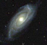
To measure relative distance, astronomers need some way to compare galaxies. Since galaxies are so similar, astronomers assume that they all have the same average properties, such as brightness and size. When we assume that two galaxies’ intrinsic brightness and size are the same, any differences in brightness or size between them are due only to differing distances away from us. For example, we can assume that a galaxy that appears twice as large as another galaxy is half as far from us.
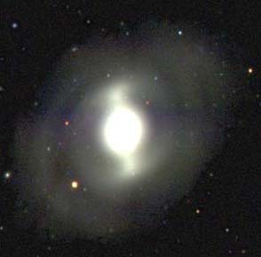

One of the easiest ways to compare galaxies is to compare their magnitudes. Magnitude can be used to measure the brightness of any celestial object, including stars and galaxies. In magnitude, higher numbers correspond to fainter objects, lower numbers to brighter objects; the very brightest objects have negative magnitudes. An increase of one number in magnitude corresponds to an increase in brightness by a factor of about 2.51 – a magnitude four object is 2.51 times brighter than a magnitude five object. The sun has magnitude -26. The brightest star in the Northern sky, Sirius, has magnitude -1.5. The brightest galaxy is the Andromeda Galaxy, which has magnitude 3.5.
The faintest object you can see with your eyes has a magnitude of about 6. The faintest object the SDSS telescope can see has a magnitude of about 23. SDSS measures magnitudes in five wavelengths of light: ultraviolet (u), green (g), red (r), two infrared wavelengths (i and z).
Exercise 1: In this exercise, you will find the magnitudes of six galaxies in the SDSS database. The table below shows the object IDs and positions (right ascension and declination) of the six galaxies.
To find a galaxy’s information, click on the object ID. When you click on the object ID of the first galaxy, the Object Explorer tool will open in a new window, displaying the galaxy’s data. When you click on another object ID, the Object Explorer will load the new galaxy’s data in the same window.
| Object ID | Right Ascension | Declination |
|---|---|---|
| 1237666408439939277 | 354.35 | 0.39167 |
| 1237663784195195105 | 354.98998 | 0.13519 |
| 1237648704592806164 | 219.31858 | 0.17731 |
| 1237659895636296017 | 260.80622 | 58.58956 |
| 1237656529458233684 | 263.94885 | 54.36385 |
| 1237651800697274648 | 150.09651 | -0.27059 |
Just to the right of the galaxy’s picture in the Object Explorer, you will see five data entries: u,g,r,i,z. These are the magnitudes of the galaxy in the SDSS’s five wavelengths. Write down one of the magnitudes (you choose which one). Then, scroll down in the left-hand frame and click “Save in Notes” to save the galaxy in your SkyServer notebook. Record the data in this workbook.
You may choose any one of the five wavelengths (u,g,r,i,z), but choose the same wavelength for each galaxy. After you save the galaxies in your notebook, you may see them again by clicking “Show Notes.”
Download Exercise 1 workbook
The workbook is an Excel spreadsheet. If you do not have Excel, you can open it with Google Spreadsheets or Open Office.
If we assume that all six galaxies emit roughly the same amount of light, then the differences in their magnitudes are due only to their different distances from us. If one galaxy has a higher magnitude than another, then we assume that it must be farther away.
In the next section of this project, you will find out how to turn the magnitudes into actual relative distances. But for now, you can use magnitudes to substitute for distances when you make your simple Hubble diagram.
Question 1: Why can magnitudes be used as a substitute for distances in the Hubble diagram?
Redshifts
Redshift is a measure of how fast a celestial object is moving relative to us. If you have ever stood by the side of the road as a car passed by, you have a sense for what redshift is. As the car moves toward you, the pitch of its engine sounds higher than the engine of a stationary car. As the car moves away from you, the engine’s pitch is lower than for the engine of a stationary car. The reason for this change is the Doppler effect, named for its discoverer, Austrian physicist Christian Doppler. As the car moves toward you, the sound waves that carry the sound of its engine are compressed. As the car moves away from you, these sound waves are stretched.
The same effect happens with light waves. If an object moves toward us, the light waves it emits will be compressed – the wavelength will be shorter, so the light will become bluer. If an object moves away from us, its light waves will be stretched, and will become redder. The degree of “redshift” or “blueshift” is directly related to the object’s speed in the direction we are looking.
Astronomers can measure exactly how much redshift or blueshift a galaxy has by looking at its spectrum. A spectrum (the plural is “spectra”) measures how much light an object emits as a function of wavelength. The spectra of stars and galaxies almost always show a series of discrete lines that form when certain atoms or molecules emit or absorb light. These “spectral emission and absorption lines” always appear at the same wavelengths, so they make a convenient marker for redshift or blueshift. If astronomers look at a galaxy and see one line at a longer wavelength than it would be on Earth, they would know that the galaxy was redshifted and moving away from us. If they see the same lines at shorter wavelengths, they would know that the galaxy was blueshifted and moving toward us.
By the end of the survey, the SDSS will have looked at the spectra of more than one million galaxies. Each spectrum is run through a computer program that automatically determines the redshift. The program outputs an image like the one below, with spectral lines marked. The “z” number at the bottom of the image shows the redshift. Positive z indicates redshift and negative z indicates blueshift.
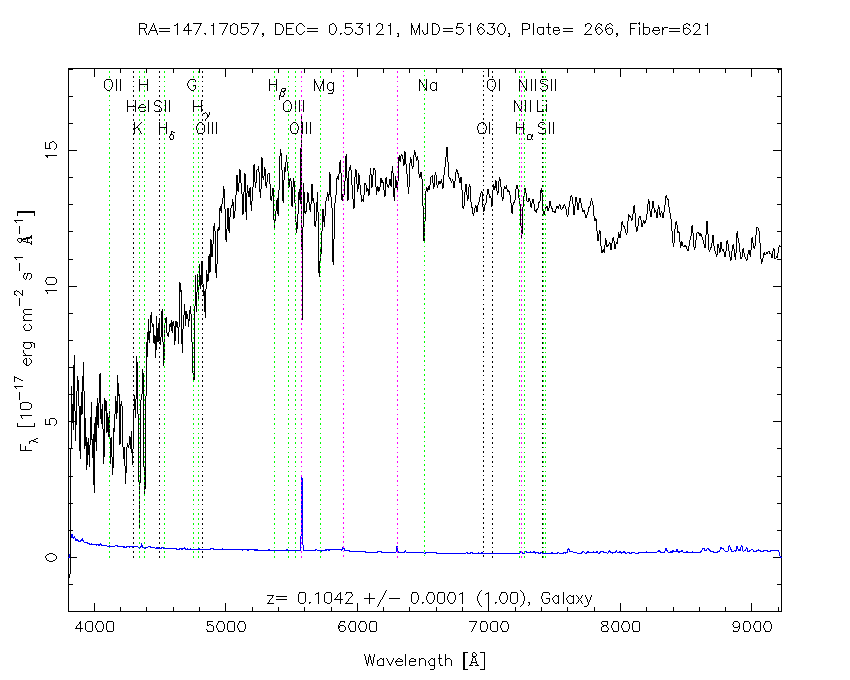
Spectra for galaxies are stored in the SDSS’s spectroscopic database. They are organized into plates and fibers, corresponding to the plate and fiber used by the SDSS spectrometer to collect them.
Exercise 2: Find redshifts for the galaxies that you used in Exercise 1. Return to the Object Explorer using the links below or by clicking “Show Notes” and clicking on each galaxy in your SkyServer notebook. Scroll down in the main window until you see the galaxy’s spectrum. Just above the spectrum, you will see a data entry for “z”. This is NOT the z magnitude from Exercise 1 – it is the galaxy’s redshift. Write down the redshift (z) value for each galaxy. Record your data in the same workbook you used for Exercise 1.
| Object ID | Right Ascension | Declination |
|---|---|---|
| 1237666408439939277 | 354.35 | 0.39167 |
| 1237663784195195105 | 354.98998 | 0.13519 |
| 1237648704592806164 | 219.31858 | 0.17731 |
| 1237659895636296017 | 260.80622 | 58.58956 |
| 1237656529458233684 | 263.94885 | 54.36385 |
| 1237651800697274648 | 150.09651 | -0.27059 |
Making the Diagram
Now that you have magnitudes and redshifts for six galaxies, you are ready to make a Hubble diagram. Use a graphing program such as Microsoft Excel or Google sheets to make your diagram. The instructions below tell you how to make the graph in Excel; to use other graphing programs, you would follow similar steps.
Exercise 3: Follow the steps below to make a simple Hubble diagram for six galaxies.
Open the workbook you have been using in Microsoft Excel or Google Sheets.
Click on a box in the Excel spreadsheet. Enter the redshift of one galaxy from Exercise 2. Hit the right arrow key, and the cursor will move to the box to the right of the first redshift. In this box, enter the magnitude of the same galaxy. Click on the box below the first redshift’s box to move the cursor to the next line. Repeat these steps to enter the redshifts and magnitudes of each of the six galaxies. You will end up with two columns of data, one for redshift and one for magnitude.
When you have finished entering the data, click on the upper-left box and drag the mouse to highlight all boxes that contain data. Then click the chart wizard, the stylized bar graph in the tools bar at the top of the page. In the chart wizard dialog box, select “XY (scatter),” then click next. On the next screen, click next again. On the third screen, give your chart a title, then label the x-axis “Redshift” in the Value X axis box, and the y-axis “Magnitude” in the Value Y axis box. Click next, and then on the next screen, click finish.
A graph of your data will appear on the same page. Click on the x-axis, and the axis will become highlighted. (If some other part of the graph is highlighted instead, click outside the graph and click the x-axis again.) Double-click the x-axis to bring up the “Format Axis” dialog box. Click the scale tab at the top of the window, then adjust the scale to be: minimum 0, maximum 0.35. Double-click the y-axis, then change the y-axis scale so that you can see all six data points clearly. Your graph should show that as magnitude increases, redshift increases. In other words, your diagram should show that fainter galaxies have larger redshifts.
Do your data really show a linear relationship between magnitude and redshift? When scientists try to find relationships in data, they often speak of a “model”: in this case, a linear model relates magnitude to redshift. Scientists often speak of the “fit” between the data and the model. The fit can be described with a percentage that shows how close the points lie to the place where they should lie if the model were true. Because every experiment has some error and every observation has some statistical uncertainty, the fit is never 100% accurate. Generally, scientists consider a fit above 90% to show that the model accurately predicts the data.
Exercise 4: Find the fit of a linear model in your Hubble diagram. Excel (or another plotting program) can find the fit automatically using a “trendline.” The program tries to find a straight line that passes as close to all the data points as possible, then measures how far each point falls from this straight line.
In Excel, click on any of the data points, and all the points should be highlighted. Under the Chart menu, select “Add Trendline.” (If “Add Trendline” is not visible, click the double arrows at the bottom of the Chart menu.) Click the Options tab, then check “Display R-squared value on chart.” (R-squared is a mathematical definition of fit.) Click OK. A number should appear in the plot area. Click it, and drag it to a part of the chart where you can read it clearly.
Multiply the R-squared value by 100 to find the fit as a percentage. What is this number? Is a straight line a good fit to your data?
Another Hubble Diagram
You have now constructed a simple Hubble diagram containing six galaxies. The data in the diagram fit well with a straight line. Now, try making the same diagram with different galaxies.
Exercise 5: Repeat Exercises 1 and 2 for the following galaxies. Record your data in this SkyServer workbook.
| Object ID | Right Ascension | Declination |
|---|---|---|
| 1237648720716103907 | 230.76984 | -0.5166 |
| 1237648720717021573 | 232.96006 | -0.47602 |
| 1237657191979483361 | 1.19287 | 0.70164 |
| 1237663783661469917 | 2.18327 | -0.27945 |
| 1237663277929070757 | 2.97483 | 0.53232 |
| 1237663278465548541 | 2.02961 | 0.99069 |
Exercise 6: Repeat Exercise 3 for these six galaxies. Graph these data on the same scale you used in Exercise 3. What do your data look like now? Repeat Exercise 4. What is the percentage fit of the data?
In Exercise 6, you used the same method you used in Exercises 3 and 4: you graphed magnitude as a function of redshift. So why does the graph you got look so different? The answer is that the assumption that underlies both graphs is sometimes true, and sometimes false. To make the Hubble diagrams, you assumed that magnitude could substitute for distance, which in turn required you to assume that all galaxies had the same average brightness.
Galaxies do have average properties. But if every galaxy were exactly the same, astronomy would be quite a boring subject. Galaxies also show a great deal of variation, and many astronomers make their careers studying these variations. Unfortunately, variations in galaxy properties make constructing a Hubble diagram trickier than simply graphing magnitude and redshift.
In the next section, you will learn some other ways astronomers measure relative distance to other galaxies. In the section after that, you will learn more about how to measure redshift. Then, you will use this knowledge to construct a better Hubble diagram, one that does not fall into the trap that this simple diagram fell into.